Essential Guide to Setting Up Your SaaS Dashboard for Metrics
Effective metrics tracking is crucial for SaaS businesses. A well-structured SaaS Dashboard for Metrics not only visualizes key data but also enables strategic decision-making. This guide outlines essential metrics to track and provides a comprehensive step-by-step setup process for your SaaS dashboard.
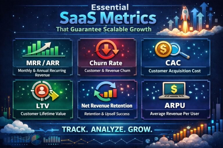
Key Metrics to Visualize on Your SaaS Dashboard
To maximize the effectiveness of your SaaS dashboard, understanding key metrics is vital. Customer Acquisition Cost (CAC) is one of the most important metrics. CAC measures the cost associated with acquiring a new customer. This includes marketing and sales expenses. Keeping this metric low is essential for profitability. A high CAC may indicate inefficiencies in your sales or marketing strategy.
Another crucial metric is Monthly Recurring Revenue (MRR). MRR provides insight into predictable revenue streams. It helps in forecasting and financial planning. Tracking MRR over time can reveal trends in customer retention and growth. An increase signifies successful upselling or renewals, while a decrease may signal the need for intervention.
Churn Rate is also essential for SaaS businesses. This metric indicates the percentage of customers who cancel their subscriptions over a specific period. High churn rates can be a red flag. They may point to dissatisfaction with your product or service. Understanding churn helps you improve customer retention strategies. Monitoring these metrics ensures that your SaaS dashboard conveys a clear picture of your business health.
Step-by-Step Guide for Effective Dashboard Setup
Setting up your SaaS dashboard begins with defining objectives. What do you want to achieve with the dashboard? This may include tracking growth, customer engagement, or service performance. Clearly defined objectives help in selecting relevant metrics. For example, if your goal is to improve customer retention, metrics like churn rate and customer satisfaction should take precedence.
Next, select a data visualization tool that aligns with your needs. Tools like Tableau or Power BI offer robust capabilities. Ensure your chosen platform integrates seamlessly with your existing systems. This integration allows for real-time data updates, providing a more accurate overview of your metrics.
Once you have the right tools, create a layout that emphasizes clarity. Use colors and graphs effectively. Different colors can represent various metrics, making interpretation easier. For instance, use red to indicate declining metrics and green for growth. Organize metrics logically, grouping related data for a cohesive view. This step is crucial for ensuring that your team can quickly understand and act on the data presented.
The Importance of Data Integration and Automation
Data integration is the backbone of an effective SaaS dashboard. By consolidating data from multiple sources, you create a unified view of your business metrics. This consistency enhances decision-making. For example, integrating customer support data alongside sales metrics can reveal insights into customer behavior. When these two data sets align, it becomes easier to anticipate customer needs.
Automation plays a critical role in maintaining dashboard accuracy. Automated reporting ensures that data is updated in real time. This reduces the risk of human error and allows for timely responses to changes in metrics. For example, if MRR drops unexpectedly, automated alerts can notify your team. This enables rapid action to address the issue.
Moreover, automation can help in data cleansing. Unreliable data can skew your metrics, leading to poor decision-making. By automating data collection and cleansing processes, you ensure the integrity of the information presented. This reliability is crucial for C-suite executives who rely on accurate data for strategic decisions.
Creating a User-Friendly Dashboard Experience
User experience (UX) is essential for dashboard effectiveness. A complex dashboard can overwhelm users. Instead, aim for simplicity and ease of navigation. Consider your audience’s needs when designing the dashboard. For example, executives may prefer high-level summaries, while analysts might require detailed data.
Incorporate intuitive navigation features. Use drop-down menus or tabs to help users filter information according to their needs. This allows users to explore data without feeling lost. Providing tooltips and guidance can further enhance the user experience. Clear labels and legends help users understand what each metric represents.
Feedback from users is invaluable. Regularly solicit input on the dashboard’s usability. This can uncover pain points or opportunities for improvement. Iterating based on user feedback ensures the dashboard remains relevant and functional. As your business evolves, so should your dashboard.
Metrics Comparison and Analysis Framework
A robust SaaS dashboard should facilitate metrics comparison. This involves setting benchmarks against which you can measure performance. For instance, compare current CAC against historical data to gauge marketing efficiency. Using tables can help visualize these comparisons effectively.
Benchmarking against industry standards is also beneficial. It allows you to see how your metrics stack up against competitors. This can uncover strengths and weaknesses in your strategy. For example, if your churn rate is higher than the industry average, it may warrant further investigation.
Employing a metrics analysis framework is useful. The “Metrics Comparison Framework” can guide your analysis. This framework includes steps like defining key metrics, setting benchmarks, and analyzing trends. By standardizing your approach, you can ensure thorough and effective analysis.
Strategic Framework for Implementation
To implement your SaaS dashboard effectively, consider a strategic framework. Use the “Dashboard Maturity Framework” to assess your current setup and identify areas for growth. This framework includes four stages: Initial, Developing, Advanced, and Optimized.
-
Initial Stage: At this stage, you might have basic metrics tracked. Focus on gathering data from core areas like sales and customer support.
-
Developing Stage: Begin integrating data from various sources. Implement automation for data collection and reporting.
-
Advanced Stage: At this level, introduce advanced analytics. Use predictive modeling to forecast trends. Ensure that your visualizations clearly communicate insights.
-
Optimized Stage: In this final stage, your dashboard provides real-time insights. You can customize views based on user preferences. Continuous feedback loops are in place for improvement.
Implementing this framework helps clarify your goals and progress. Each stage builds on the last, creating a cohesive strategy for dashboard enhancement.
Executive FAQ
1. What is the impact of CAC on profitability?
Customer Acquisition Cost directly affects profitability. High CAC can erode margins. It’s essential to optimize marketing efforts to lower CAC while maximizing customer lifetime value (CLV). A balance between the two can enhance overall profitability.
2. How do I manage data security in my dashboard?
Data security is paramount in dashboard setup. Implement strict access controls and encryption. Regular audits can help identify vulnerabilities. Always stay compliant with regulations like GDPR to ensure customer data protection.
3. How does churn rate affect long-term growth?
A high churn rate can hinder growth. It indicates customer dissatisfaction. Addressing churn can lead to improved customer retention, which is usually less expensive than acquiring new customers. Long-term growth relies on maintaining a loyal customer base.
4. What are the costs associated with dashboard implementation?
Costs vary based on tools and integrations. Initial setup fees may include software licenses, training, and personnel. Ongoing costs can include subscriptions, maintenance, and updates. A well-planned budget can help mitigate unexpected expenses.
5. How do I ensure cross-functional alignment in dashboard metrics?
Cross-functional alignment requires collaboration across departments. Regular meetings can help ensure teams understand the metrics. Setting shared goals fosters a collective approach to achieving business objectives.
6. What role does real-time data play in decision-making?
Real-time data provides immediate insights. Quick access allows for timely decision-making, especially in fast-paced environments. This can lead to proactive rather than reactive strategies, enhancing overall responsiveness.
7. How do I measure the ROI of my dashboard setup?
Measuring ROI involves comparing the costs of dashboard implementation against the benefits gained. Look at improvements in efficiency, time saved, and enhanced decision-making. Quantifying these benefits can illustrate the dashboard’s value.
8. What considerations are there for legacy system integration?
Integrating legacy systems can be complex. Assess compatibility with new tools. Plan for potential data migration challenges. Establish a timeline to minimize disruption to business operations during integration.
Conclusion – SaaS Dashboard for Metrics
Setting up your SaaS dashboard for metrics is not just about visualization; it’s a strategic endeavor. By focusing on essential metrics and following a structured implementation process, organizations can enhance decision-making and drive growth. Leveraging the insights from your dashboard will empower your team to make informed, data-driven decisions that propel your business forward.